Veronica
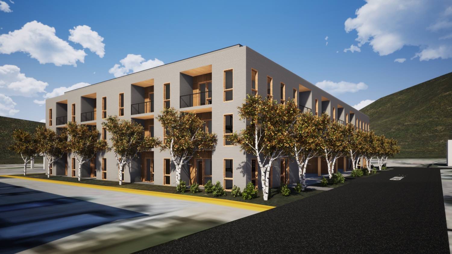
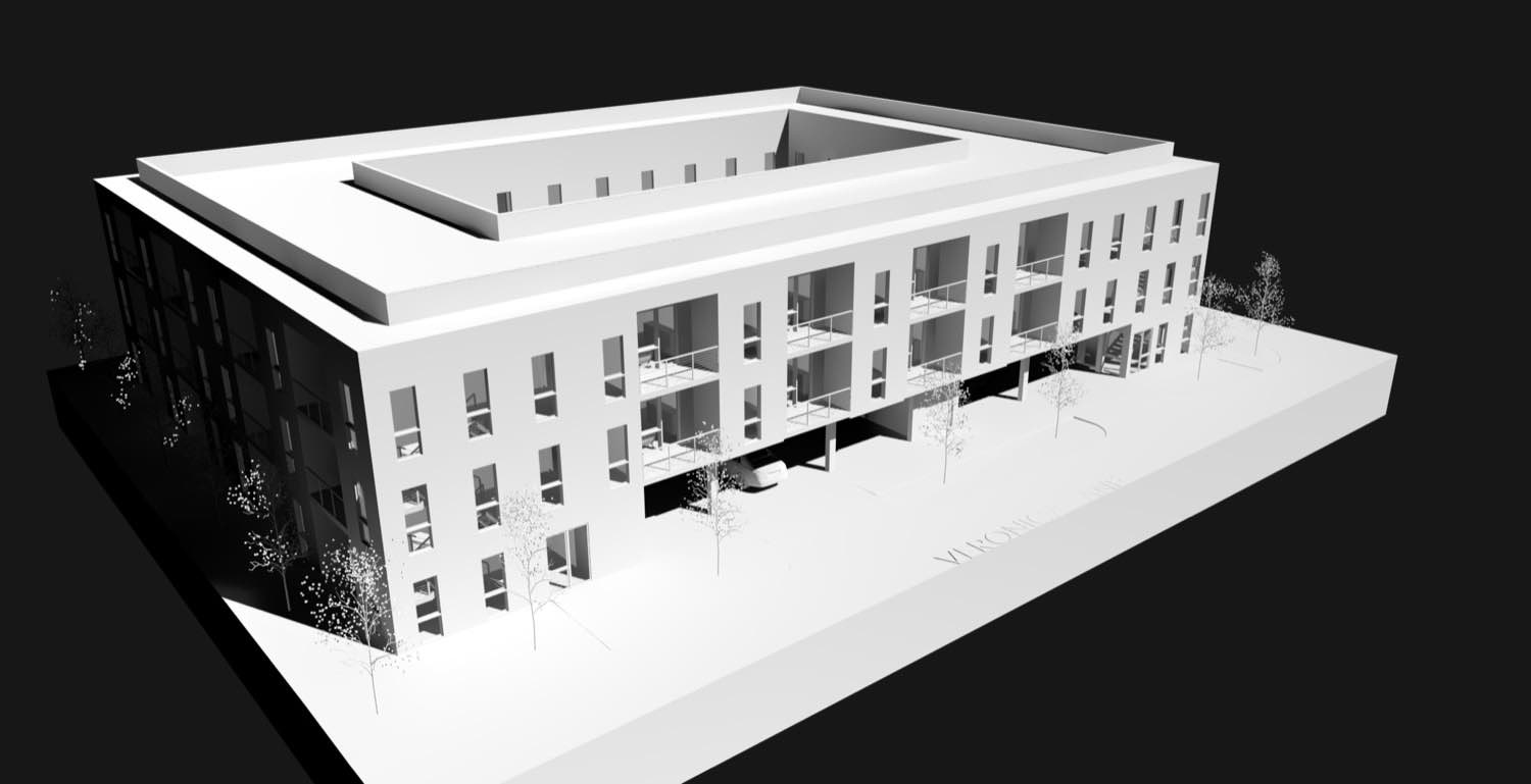
We designed Veronica to sit lightly on its site, using a series of stepped volumes that follow the natural grade rather than fighting it. The massing breaks down what could have been a large single structure into a composition of connected forms, each responding to specific programmatic needs and views.
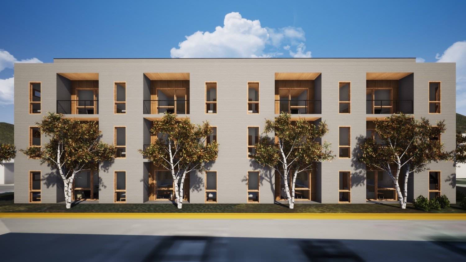
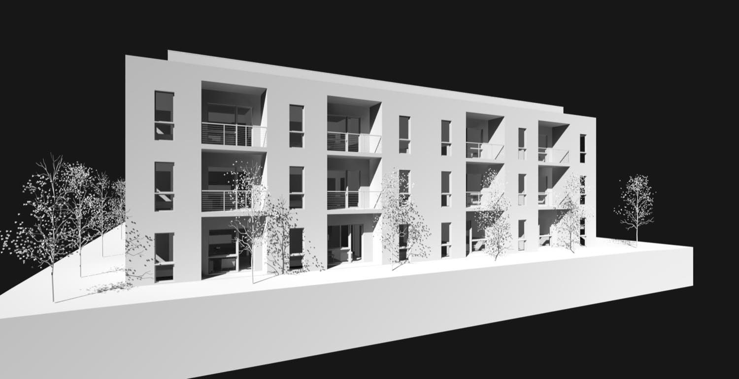
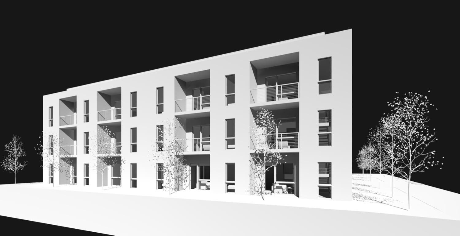
The primary living volume anchors the composition. We oriented it to capture western light while screening less desirable views to the north. Large expanses of glass open the interior to the landscape, but they're carefully sized and positioned. Every window placement emerged from interior experiences first. Where does natural light matter most? What views justify the exposure? How do we maintain privacy while staying connected to the surroundings?

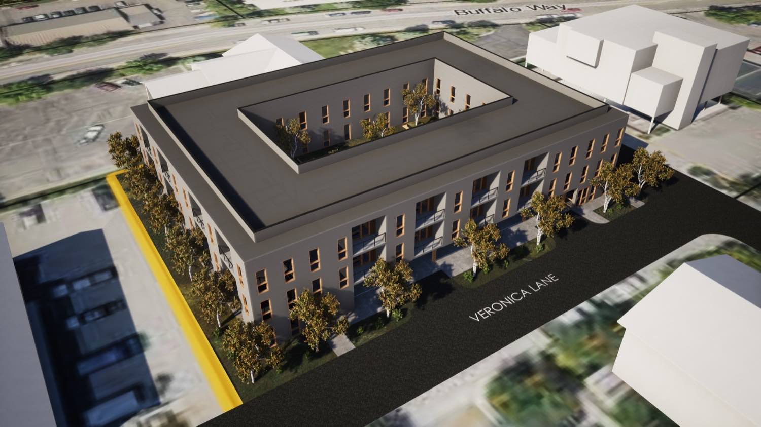
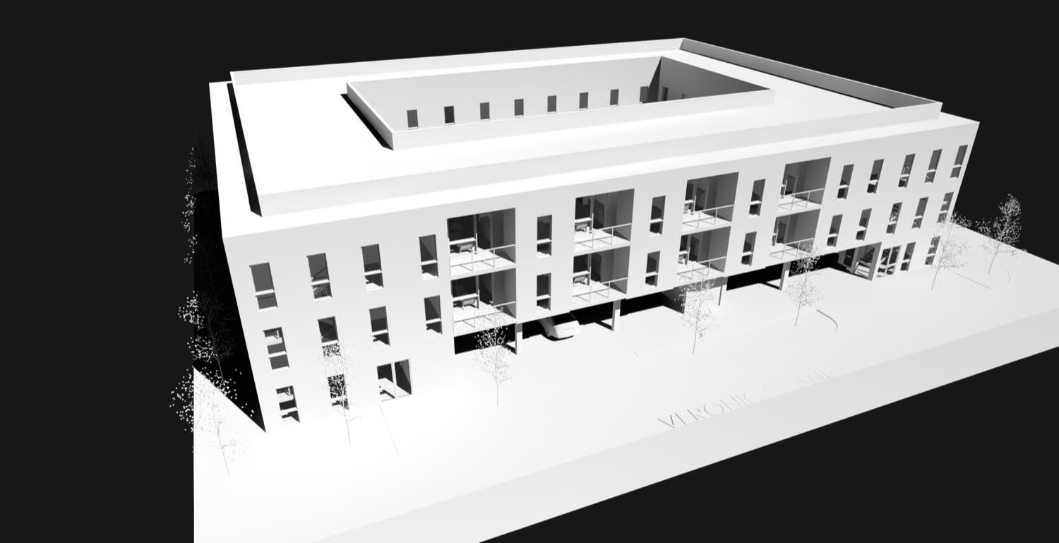
The secondary volumes step down from the main structure, creating outdoor spaces between forms. These aren't arbitrary gestures. Each shift in massing corresponds to a change in function or ceiling height inside. The varying roof planes reduce the visual mass from different approaches while creating spatial variety within.
We detailed the exterior with a restrained material palette. Clean siding establishes the primary surfaces, with stone accent walls grounding the building to its site. The material transitions happen at logical points, usually where massing changes or where we need visual weight at the base. This isn't decoration, it's about expressing how the building meets the ground and how different volumes relate to each other.
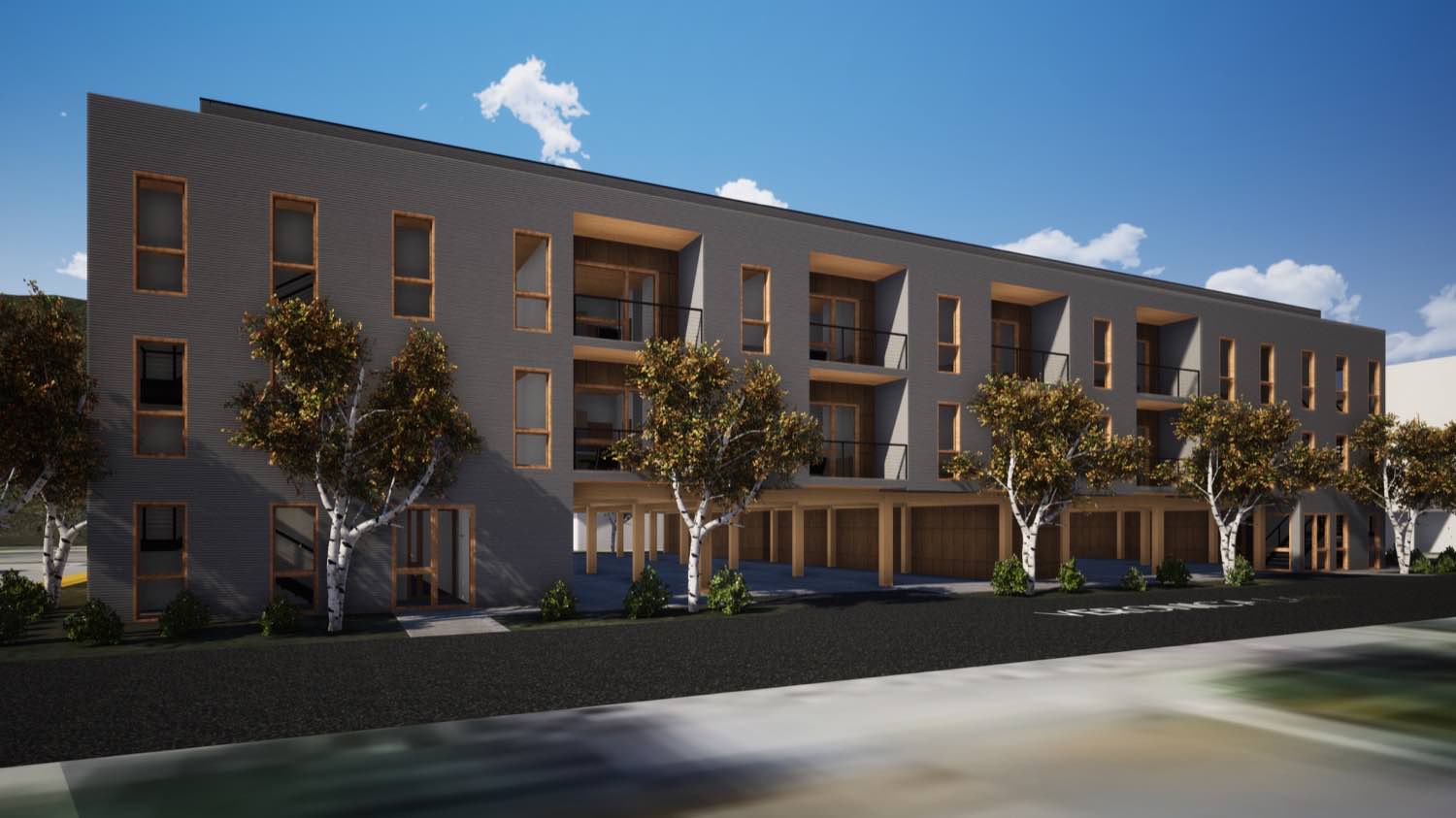
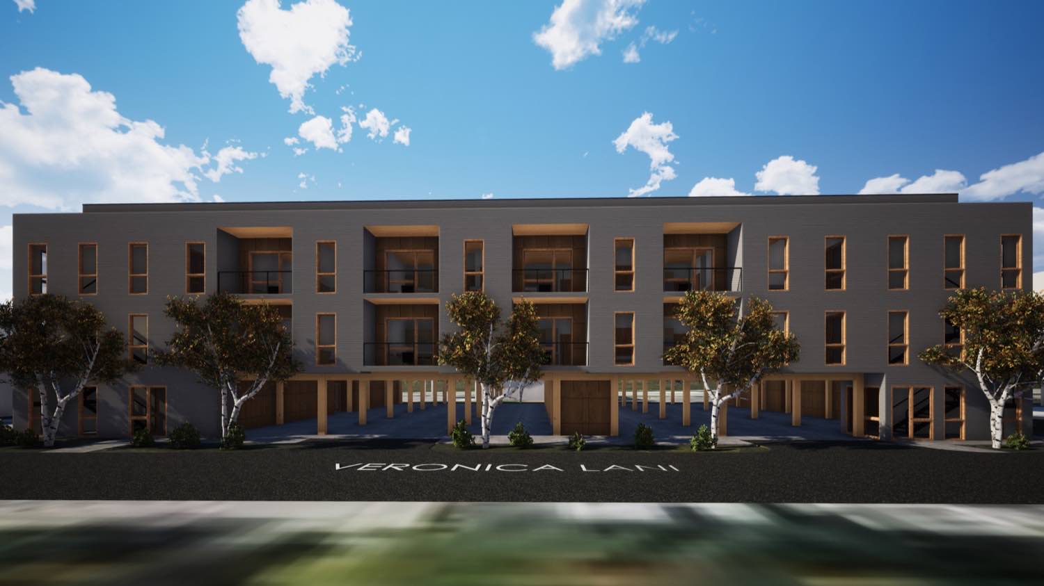
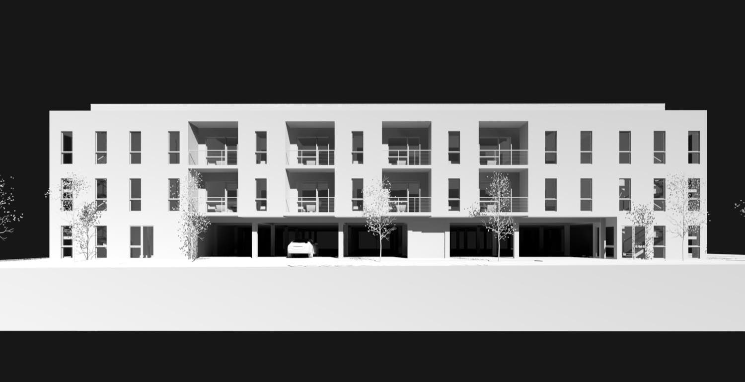
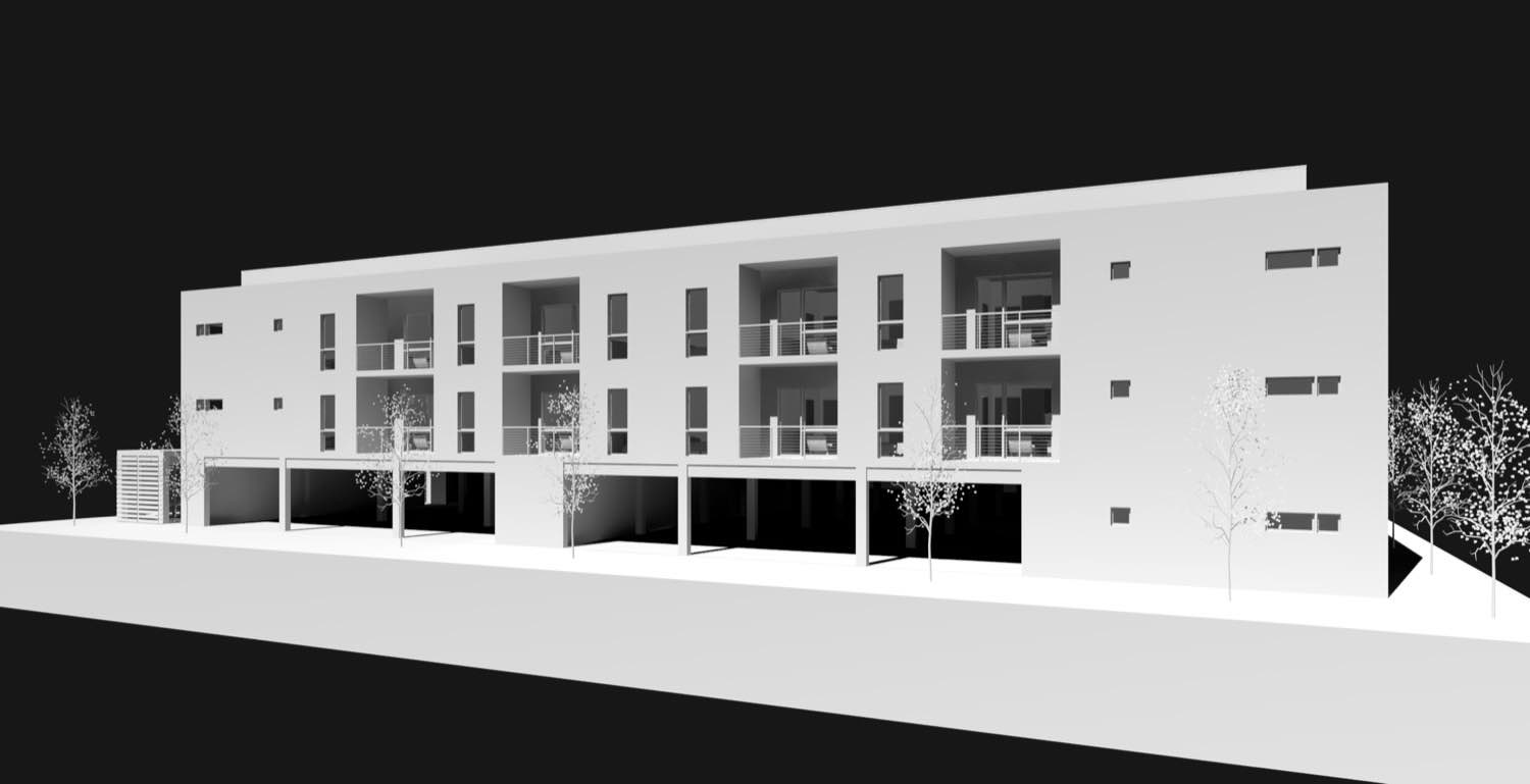
The covered outdoor spaces extend the living area without enclosing it. Deep roof overhangs provide genuine weather protection, creating usable outdoor rooms that work in multiple seasons. The structural system remains visible, with exposed beams and posts that establish rhythm across the facade. When you're designing these covered areas, they need to feel connected to the house but not trapped by it.
The entry sequence matters. Instead of arriving at a single dominant facade, you approach through a series of outdoor spaces that reveal the building gradually. The motor court sits to the side, keeping vehicles from dominating the arrival experience. This approach creates a more gradual transition from public to private space.
From different angles, the composition shifts. What reads as a unified whole from one direction breaks into distinct volumes from another. That's intentional. The varying heights and depths create visual interest while keeping the overall scale residential. We're using simple forms and letting the proportions and relationships between volumes create the architectural character.
The site strategy minimized grading. Rather than creating a flat pad and setting the house on top, we stepped the foundation to follow existing contours. This reduces visual impact and creates opportunities for walkout access at multiple levels. It requires more coordination during construction, but the result is a building that settles into the landscape rather than imposing on it.
The fenestration pattern emerged from thinking about interior spaces first. Horizontal window bands bring in views and light where ceiling heights allow. Vertical groupings create focal points and frame specific landscape moments. Punched openings maintain privacy where needed. Each decision serves the interior experience, but collectively they create a coherent exterior composition.
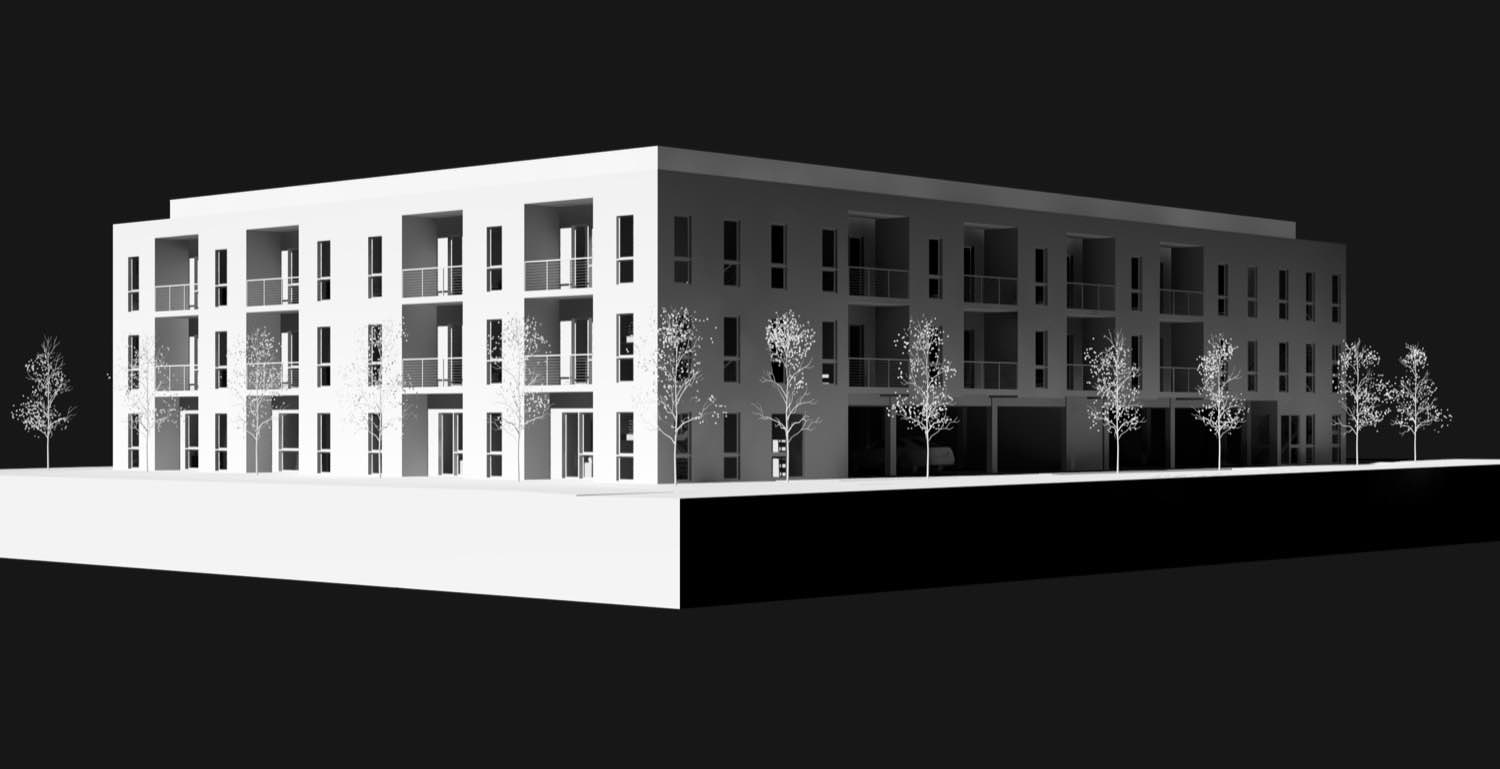
Veronica works because every element has purpose. The massing responds to grade and program. The materials express structure and grounding. The windows serve interior function while creating exterior rhythm. We're not chasing complexity or simplicity for their own sake. We're solving specific problems with straightforward architectural moves that add up to something coherent.
If you're working with a sloping site or interested in how stepped massing can reduce building scale while creating richer spatial experiences, reach out. These are the kinds of design challenges we spend our time thinking about.