The Retreat
We designed this project around the idea of separation. The clients wanted a place where they could disconnect from daily routines, but they also needed space for guests without sacrificing privacy. The solution was to create distinct zones, each with its own character and purpose, organized around outdoor space rather than interior hallways.
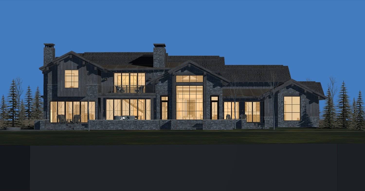
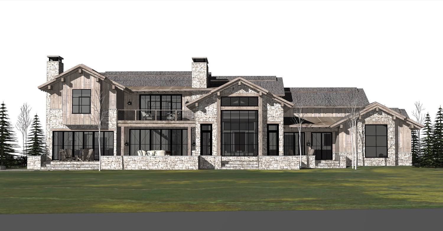
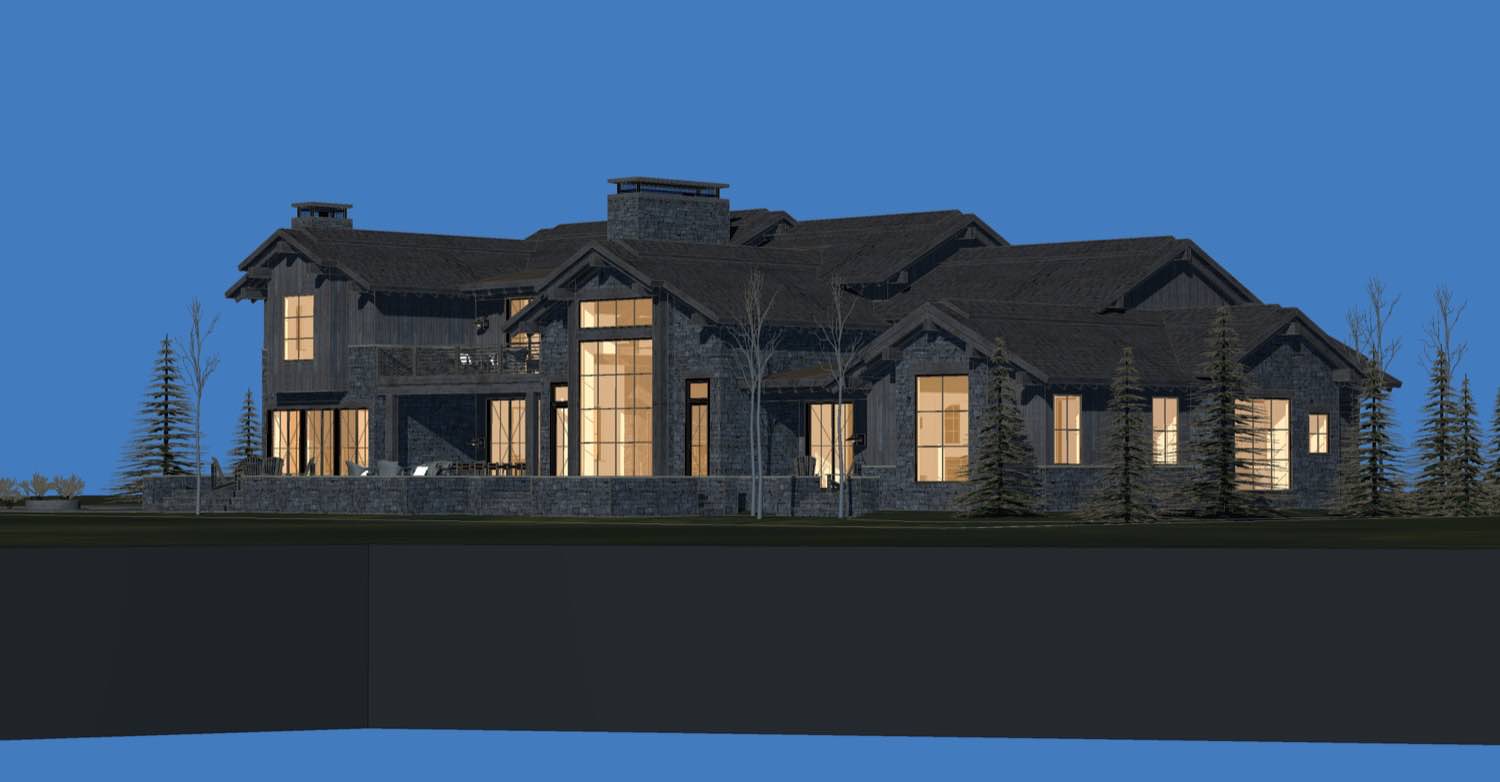
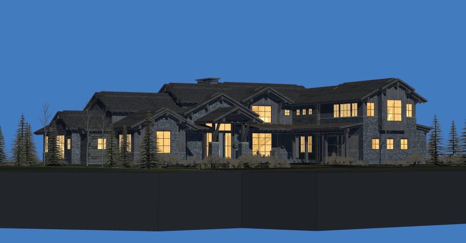
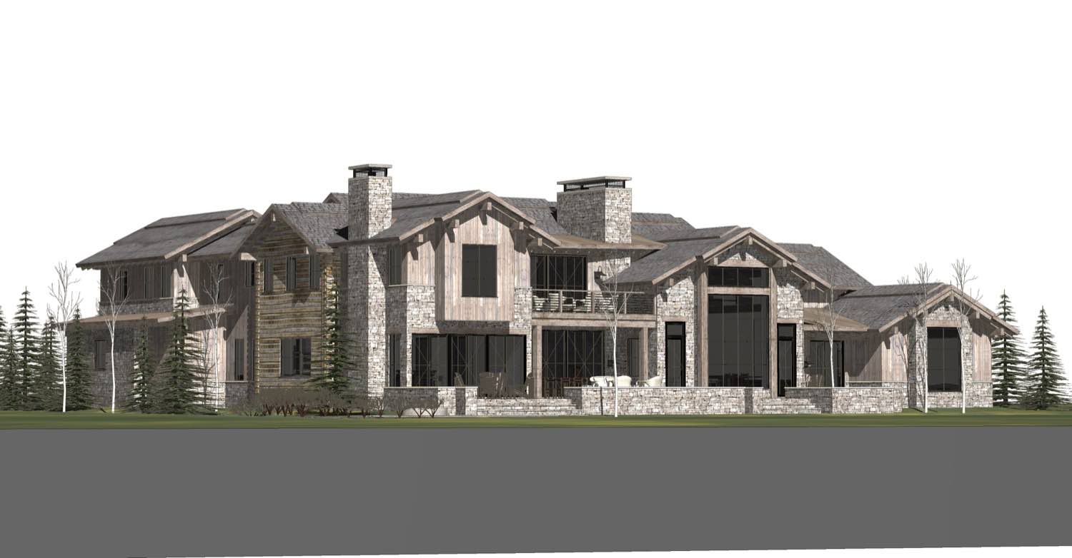
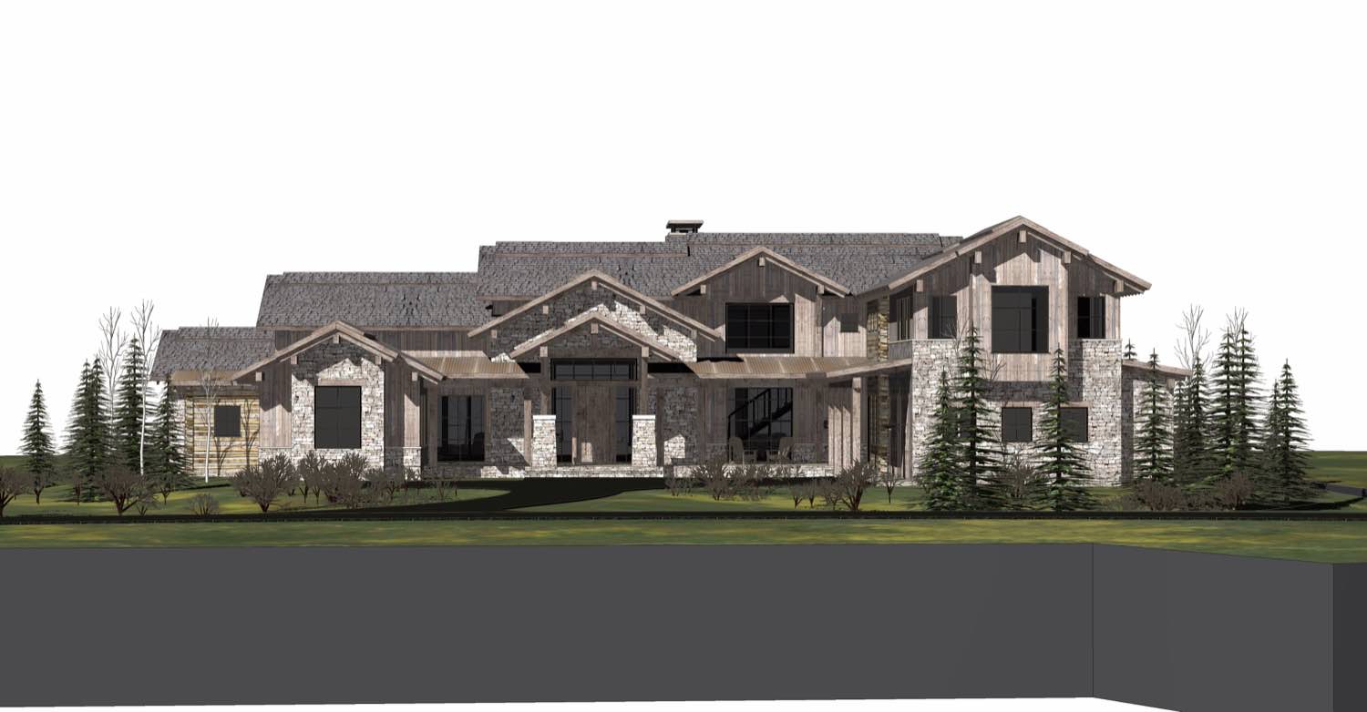
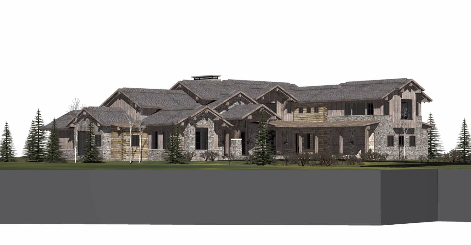
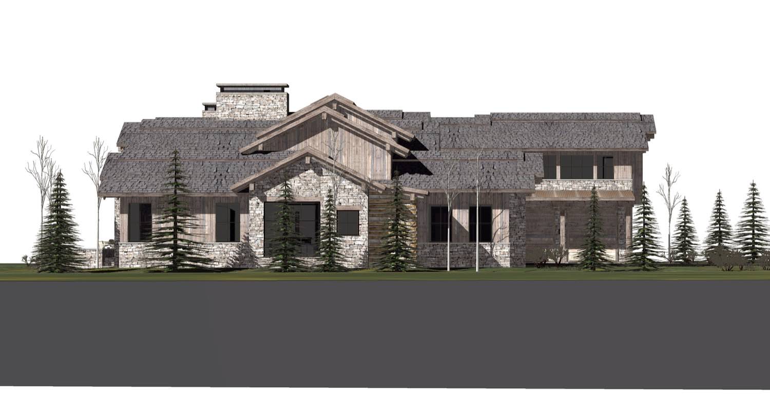
The main residence sits at the heart of the property. We used simple forms and a restrained material palette, letting the proportions and details do the work. Large expanses of glass open to the landscape, while solid walls provide privacy where needed. The rooflines are clean and low-pitched, keeping the building grounded and avoiding any sense of trying too hard.
The circulation between buildings matters as much as the buildings themselves. Covered walkways and outdoor passages connect the main house to the guest quarters and support structures. This separation forces you to experience the site as you move through it, rather than passing through generic interior corridors. Weather becomes part of daily life here.
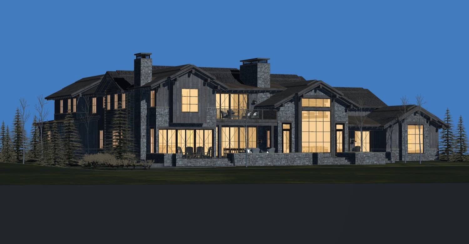
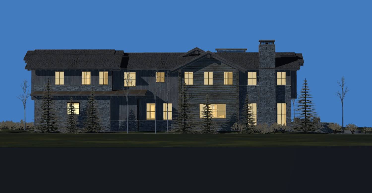
Material choices were straightforward. Natural wood siding that will weather over time, blending into the surrounding landscape. We detailed the cladding with clean horizontal lines that emphasize the building's relationship to the ground plane. The window openings are generous but carefully positioned, creating specific views rather than indiscriminate glazing.

The guest house operates independently. It's not an afterthought attached to the main building, but a fully realized structure with its own logic. Same design language, same material approach, but scaled for its specific function. Guests have everything they need without entering the primary residence.
Inside, the spaces are open where they should be and enclosed where privacy matters. The main living area flows naturally from kitchen to dining to living without walls interrupting sight lines. Ceiling heights vary to define zones, creating spatial interest through volume rather than decoration.
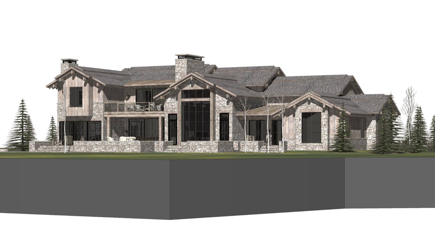
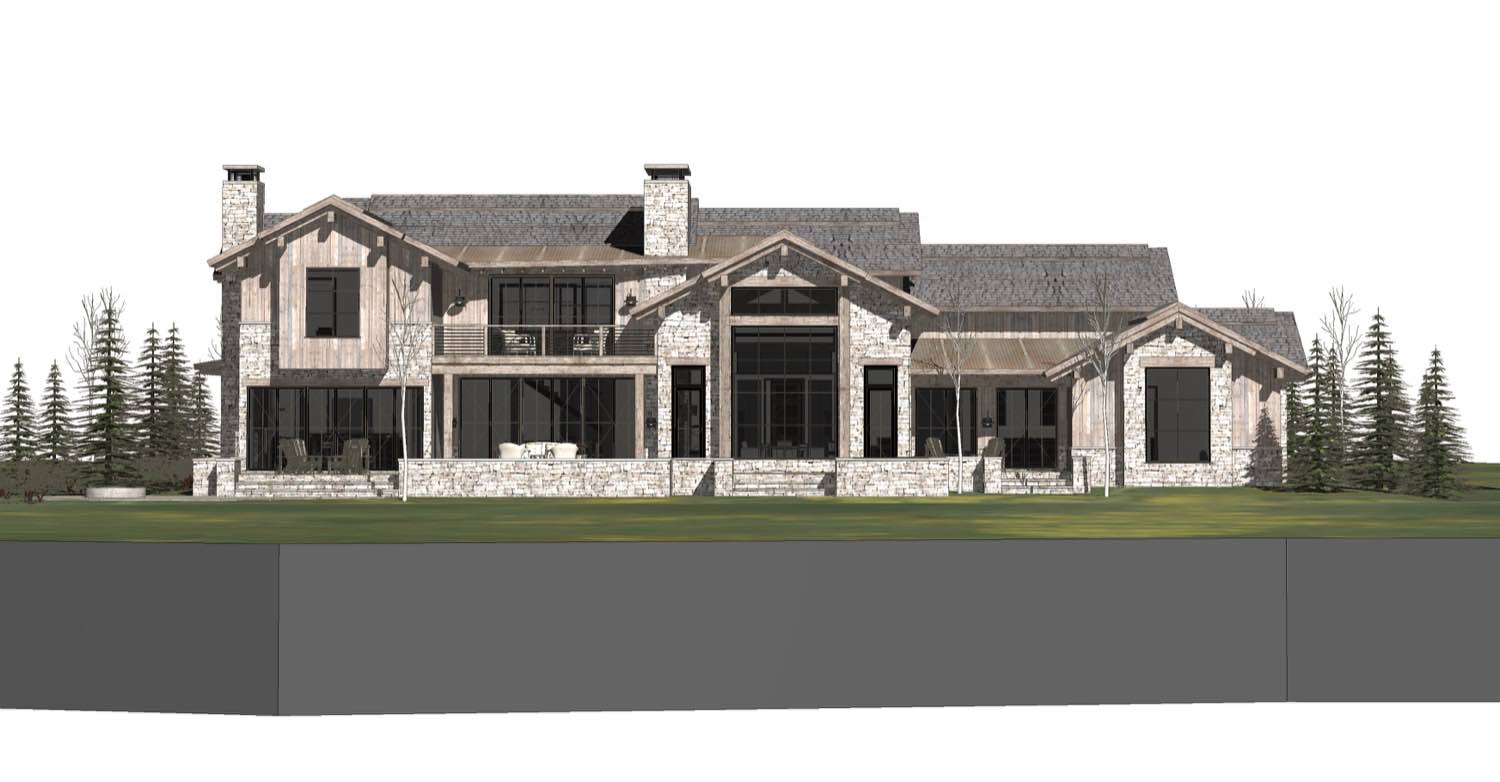
We integrated covered outdoor living areas that extend the usable space during warmer months. These aren't token gestures but real rooms with proper proportions and weather protection. The overhangs are deep enough to actually work, providing shade and keeping rain off the threshold.
The site planning prioritizes views and orientation. We positioned buildings to capture the best landscape moments while using topography to our advantage. The structures step with the grade rather than fighting it, minimizing cut and fill while creating natural terraces and level changes that make the property feel larger than its actual footprint.
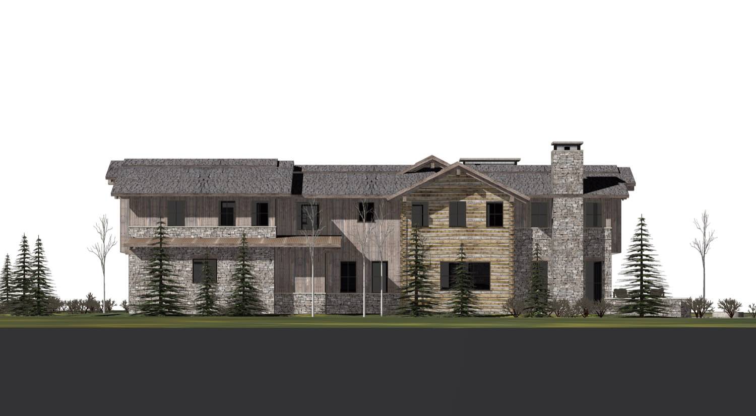
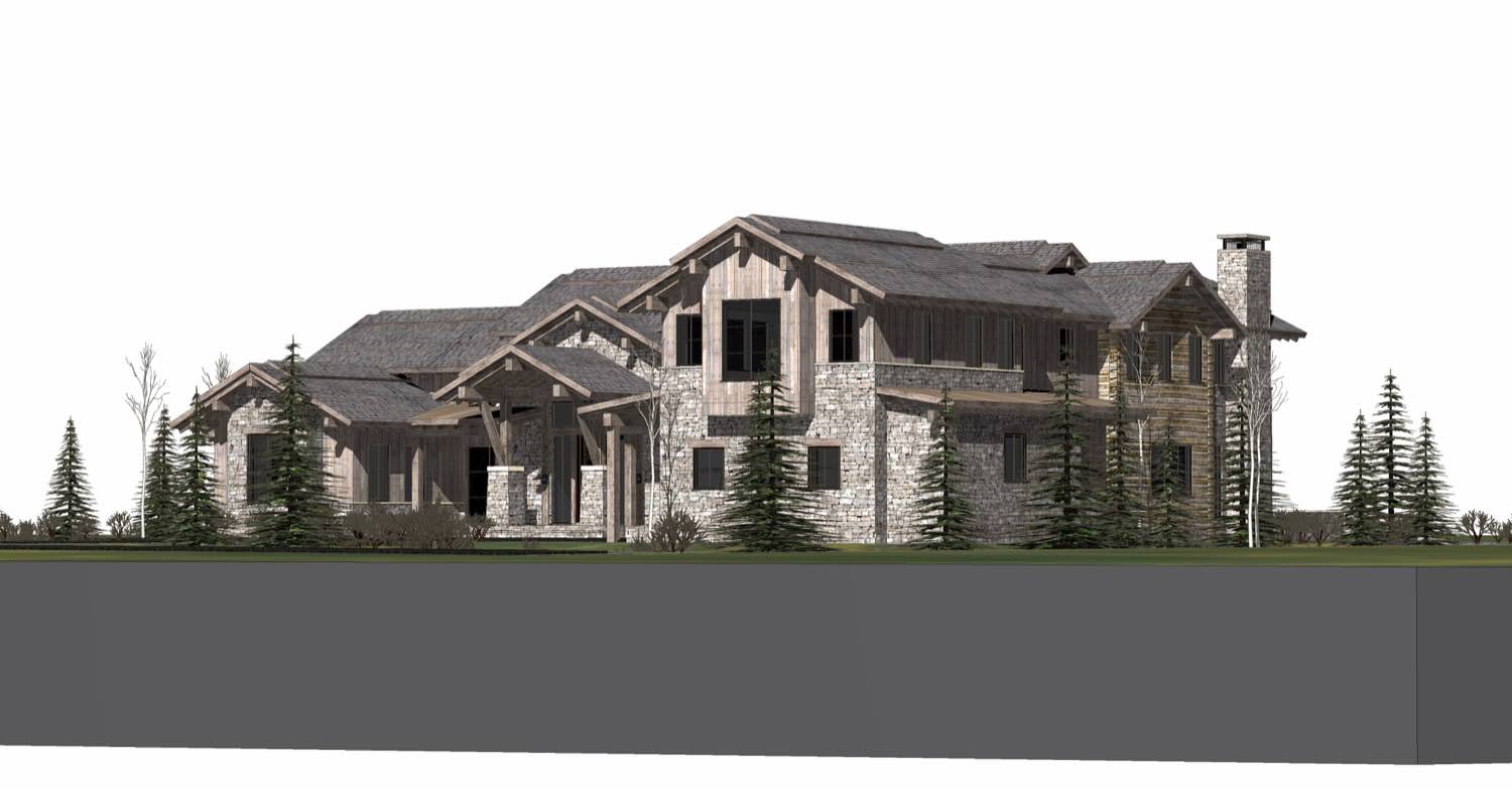
Details are kept simple throughout. Exposed structure where it makes sense, clean joints, and honest material connections. We avoided unnecessary ornamentation, letting the quality of construction and thoughtfulness of proportion create visual interest.
The private areas are separated from public spaces, giving the clients true retreat within their retreat. Bedrooms have direct access to outdoor space and are positioned for optimal light and privacy. No bedroom feels like an afterthought or awkwardly placed because we had to fit it somewhere.
This project works because it responds directly to what the clients needed: genuine separation without isolation, connection to landscape without exposure, and spaces that support both solitude and gathering. The compound approach creates variety in experience while maintaining architectural coherence across all structures.
If you're considering a project that requires balancing privacy with connectivity, or if you're working with a site that demands multiple structures rather than one large building, we should talk. These kinds of spatial relationships are what we spend most of our time thinking about.