Metal and Wood Layers
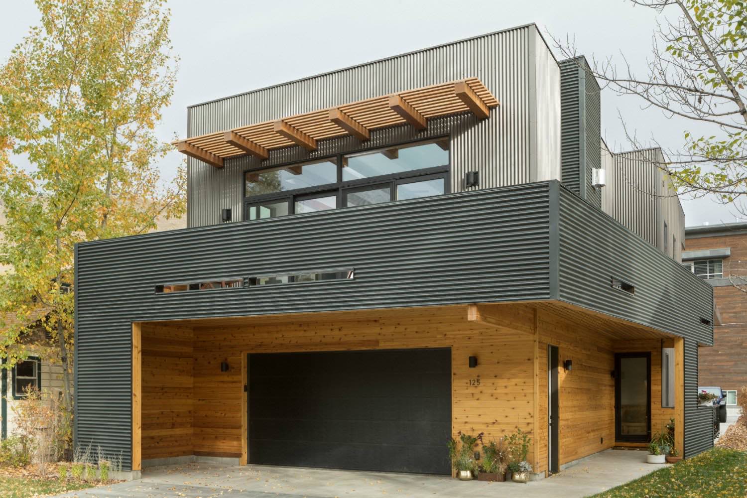
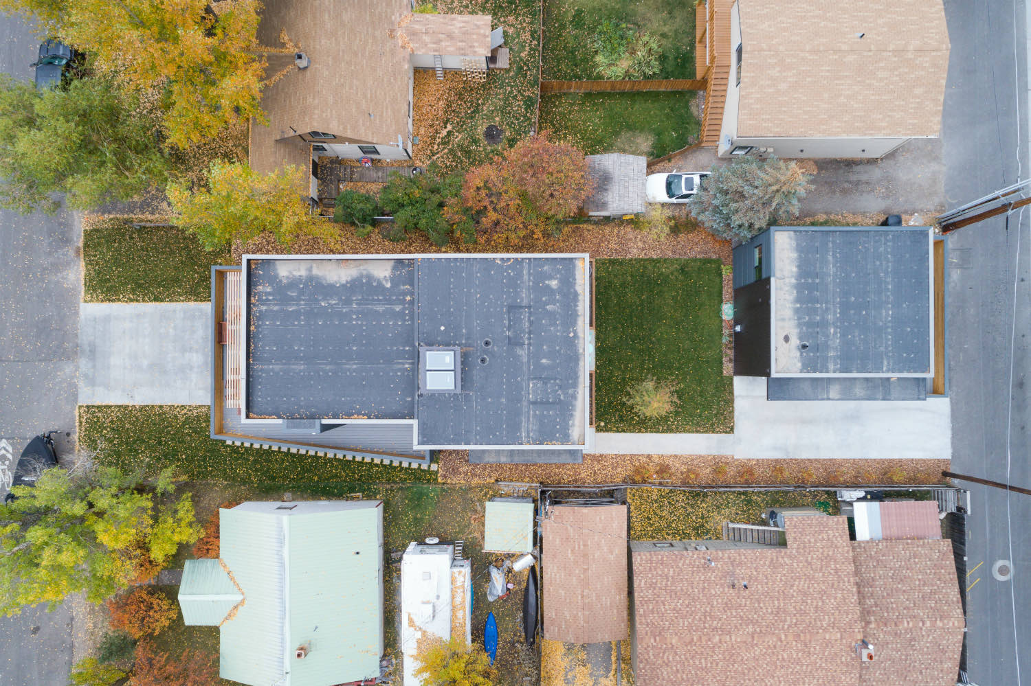
There's something to be said for working on a tight infill lot in town. The constraints force decisions that might not happen otherwise. This house occupies a narrow site in what looks like an established neighborhood, with existing homes visible on either side. The solution was to build up, not out, creating a compact three-story volume that maximizes the available footprint.

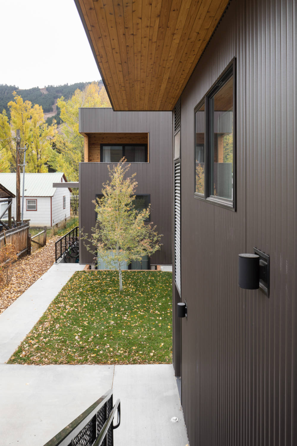
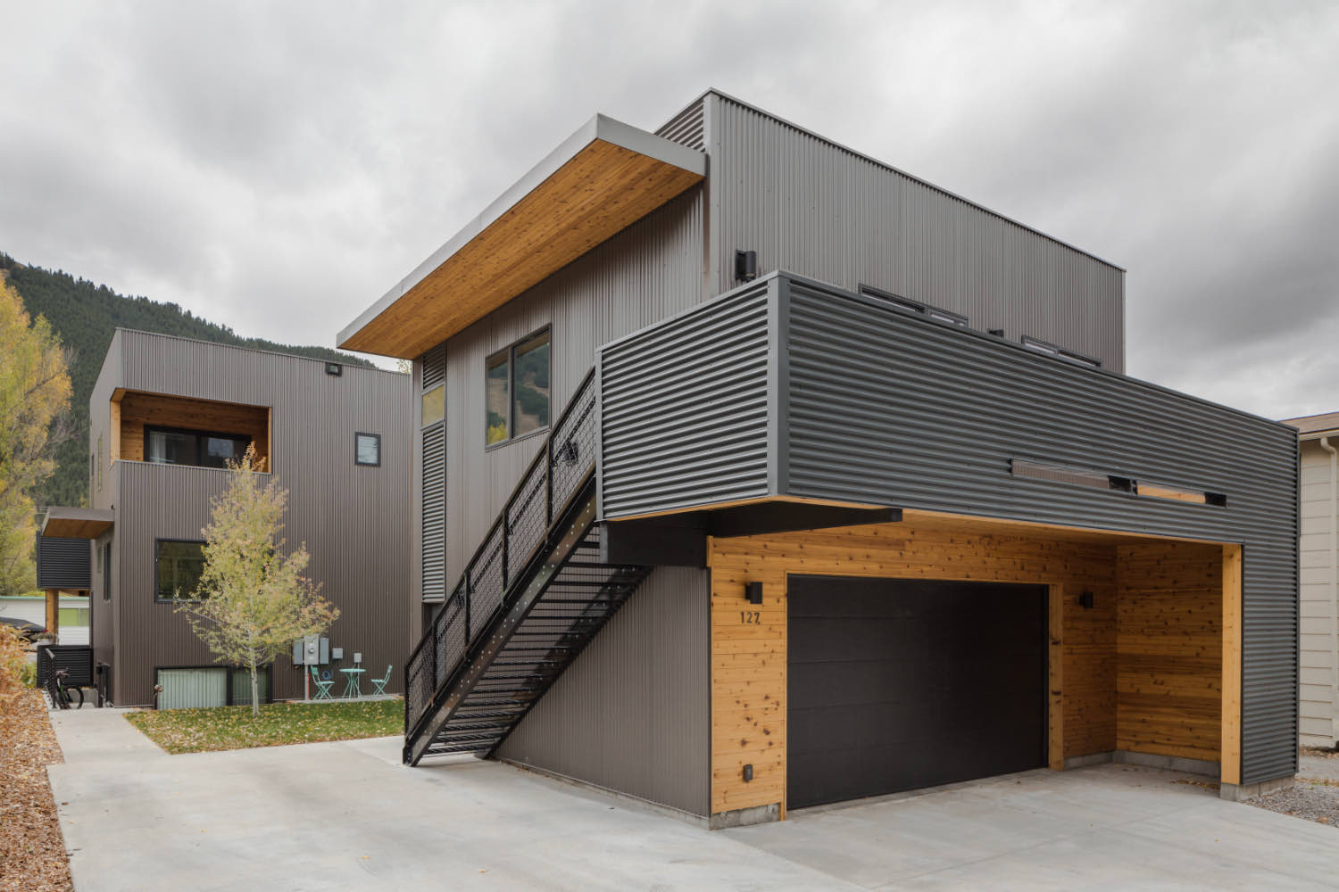
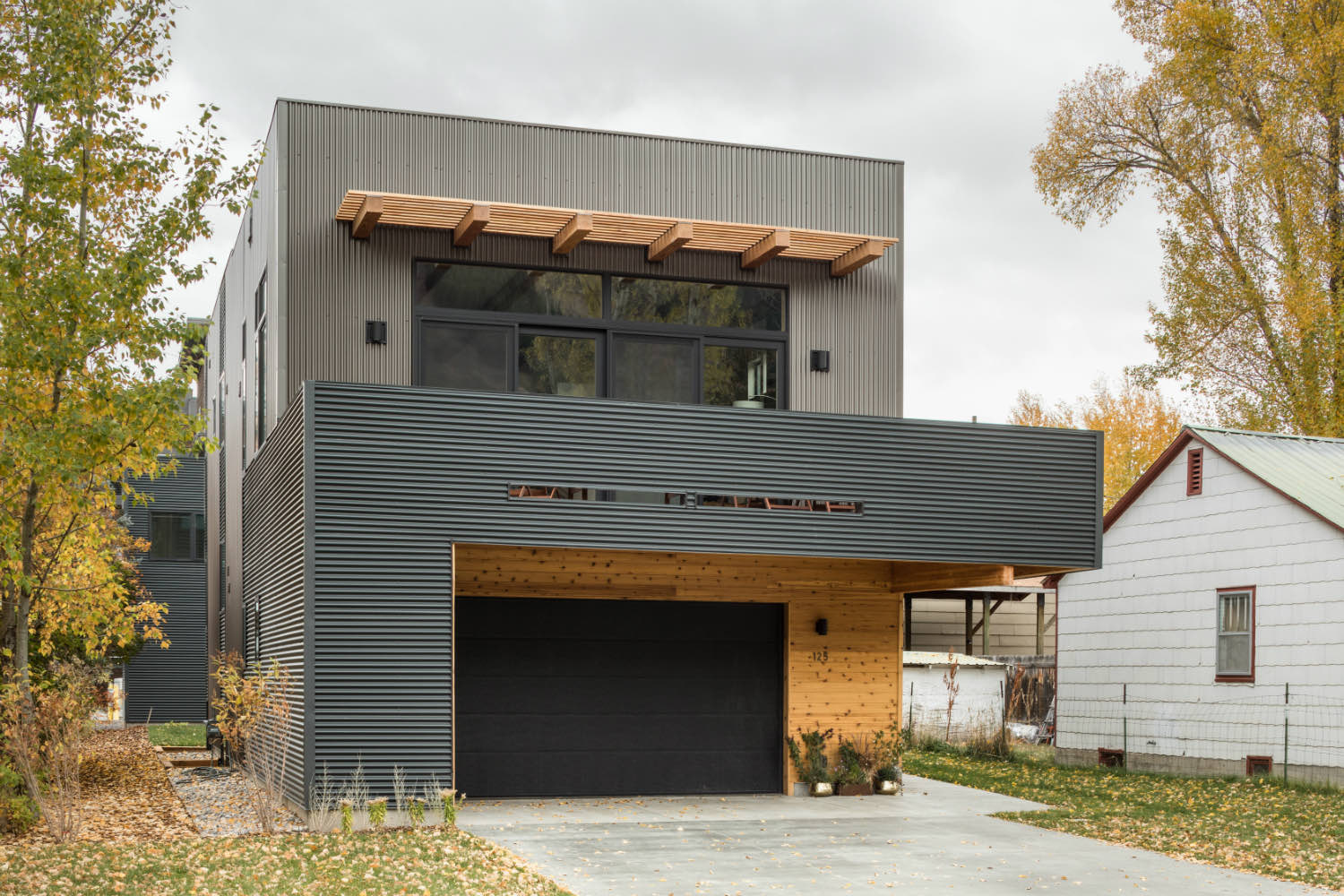
The exterior uses corrugated metal siding in two different profiles and orientations. The upper floor is clad in vertical ribbed panels with a lighter finish, while the middle level wraps in horizontal corrugated metal with a darker, almost charcoal tone. It's a simple move that breaks down the scale of the building and adds some visual interest without getting complicated. Wood shows up strategically at the entry level, framing the garage and creating warmth where people actually interact with the building.
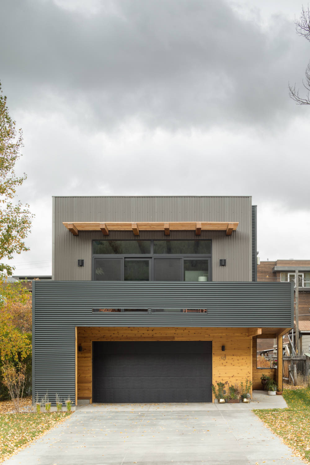
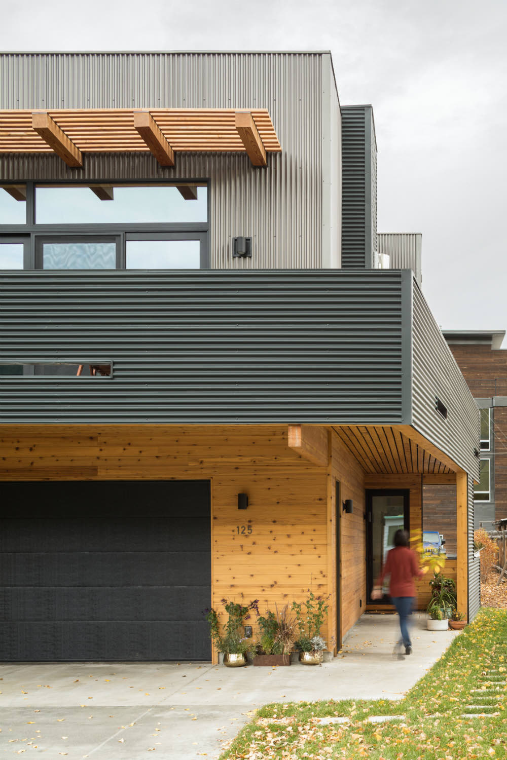
A timber pergola structure sits above the upper windows, providing some shading and reinforcing the horizontal while framing views to the mountains beyond. It's functional and architectural at the same time, which is how these elements should work.
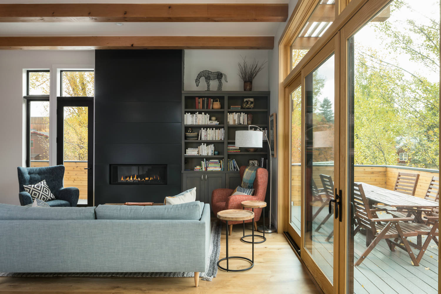
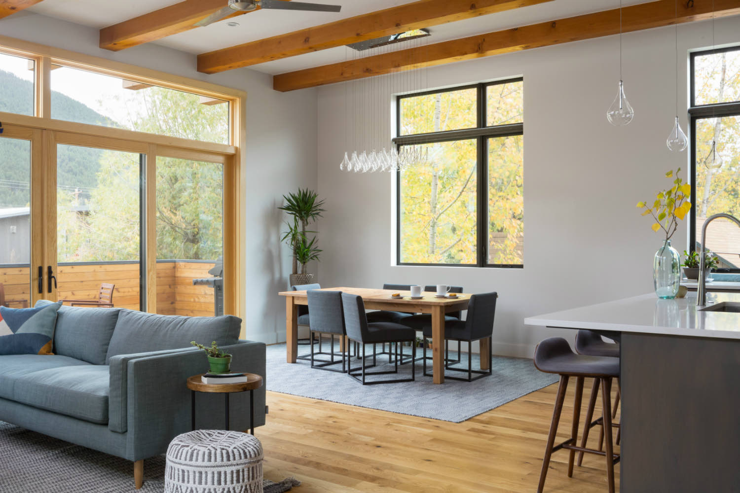
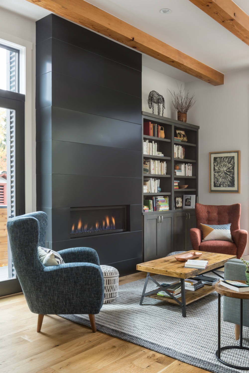
The main living spaces occupy the second floor, taking advantage of light and views. Large wood-framed windows with transoms above bring in plenty of daylight and connect to the landscape. Inside, exposed timber beams span the ceiling, their substantial character balancing the more refined finishes elsewhere in the space.
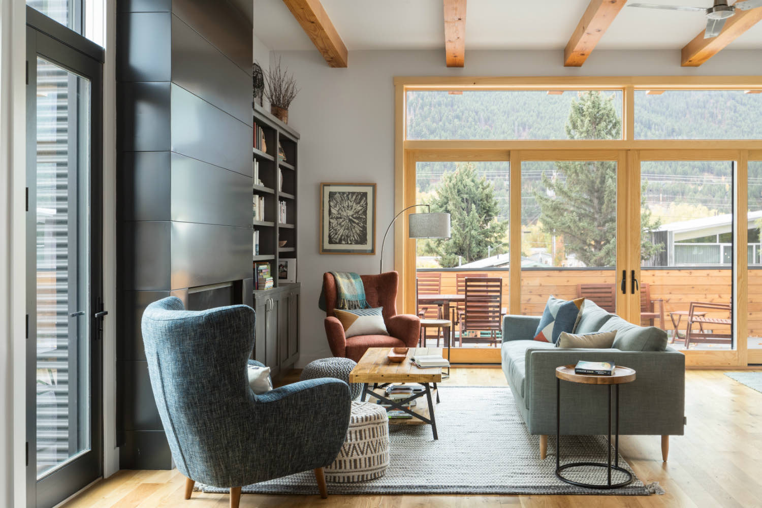
The living room opens directly to a deck through sliding glass doors, extending the usable space outdoors. A steel-faced fireplace wall provides a dark focal point and includes built-in shelving. The palette stays restrained throughout with white walls, natural wood flooring, and those exposed beams overhead keeping things grounded.
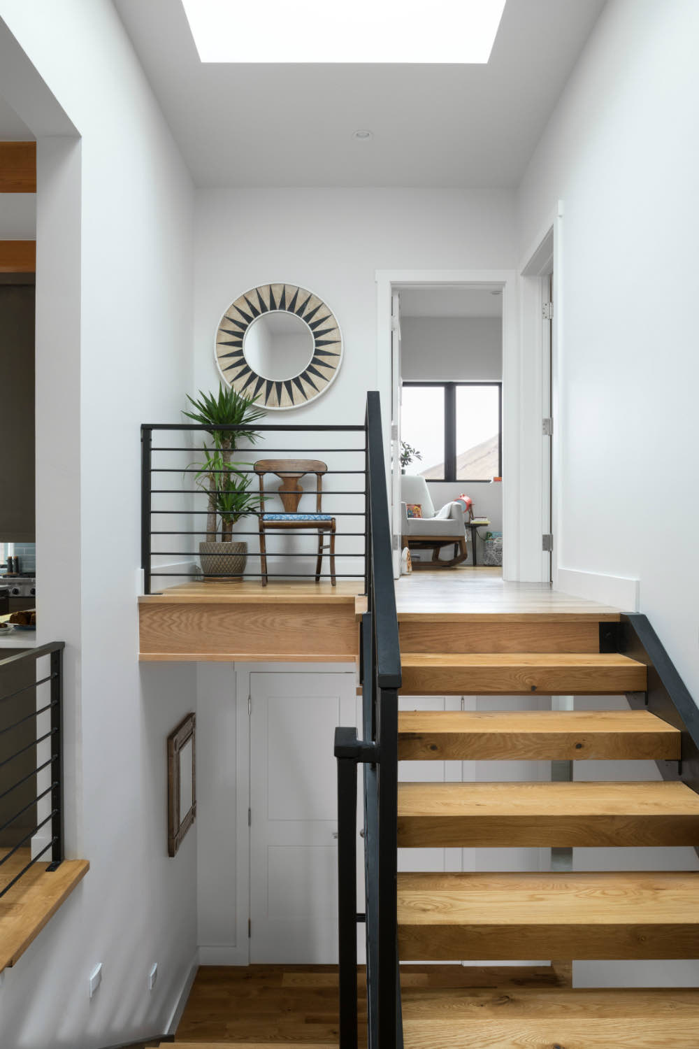
Circulation happens through a central stair with black steel railings and wood treads. Natural light from a skylight above washes down the white walls, making the vertical movement through the house feel open rather than compressed. There's storage worked into the stair landing, utilizing every available inch.
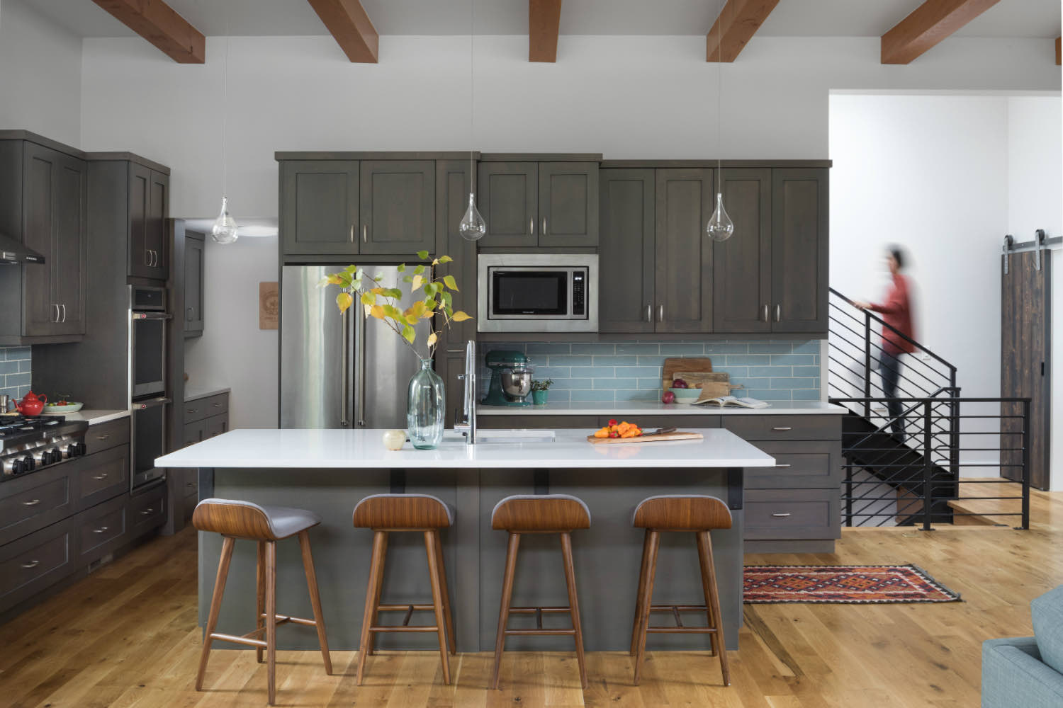
The kitchen runs along one side with dark gray cabinetry and a large island. A blue-gray tile backsplash adds some color without overwhelming the space. The same timber beams continue overhead, tying this area to the living room visually. The open plan means kitchen, dining, and living all share volume and light.
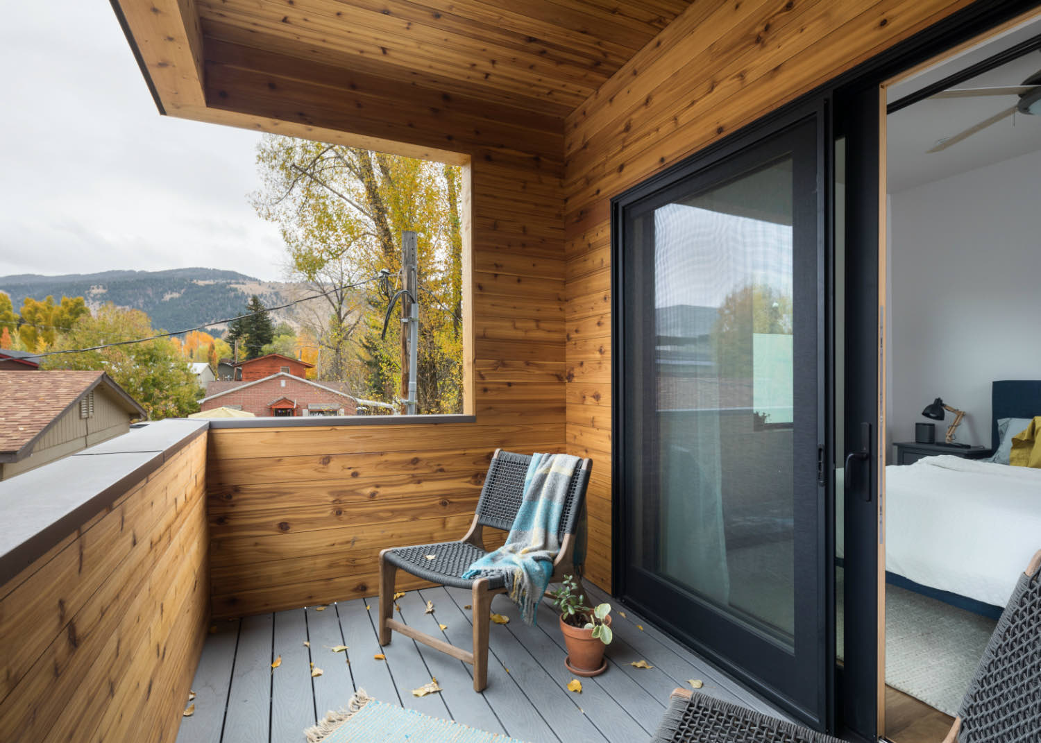
Windows are positioned to capture views while maintaining privacy from neighbors. Black-framed windows contrast against the wood decking and railings on the private balcony off the bedroom. The mountains provide a constant backdrop, visible from multiple levels of the house.
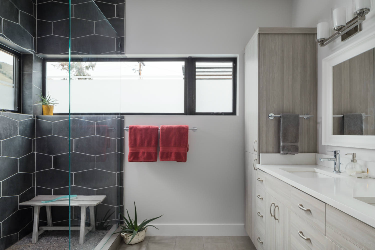
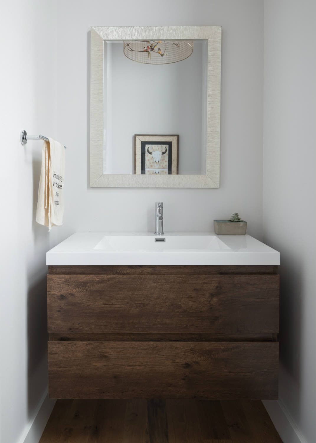
In the bathrooms, material choices stay consistent with the rest of the house. One bathroom features large-format dark hexagonal tiles in the shower, while another uses a floating wood vanity with a clean white countertop. These spaces feel considered without being precious.
The three-story configuration includes what appears to be a separate lower unit with its own entrance, accessible by an exterior steel stair. This kind of flexibility makes sense in a mountain town where rental income can offset costs or provide space for extended family.
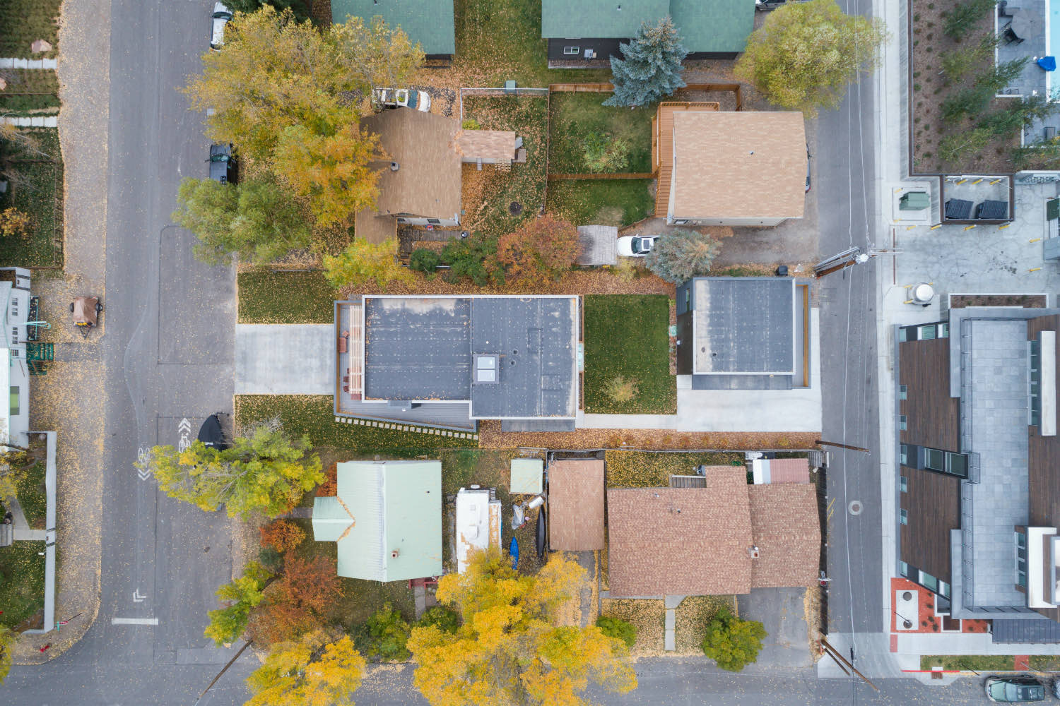
From above, you can see how efficiently the building sits on its lot. Solar panels on the flat roof offset energy costs. The narrow site meant careful coordination of setbacks and massing, but the result is a home that works with its context rather than fighting it.
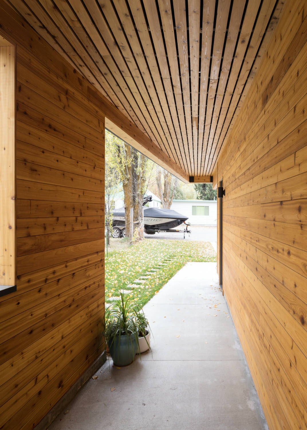
The entry sequence is worth noting. A wood-lined breezeway with a slatted ceiling leads from the street to the front door, creating a moment of compression before you enter. It's a threshold that makes the transition from public to private feel intentional.
Infill projects like this require thinking vertically about what typically gets spread across a single floor. The reward is living close to town with outdoor space and mountain views. It's a different kind of mountain living, but one that fits how people actually want to use these places.
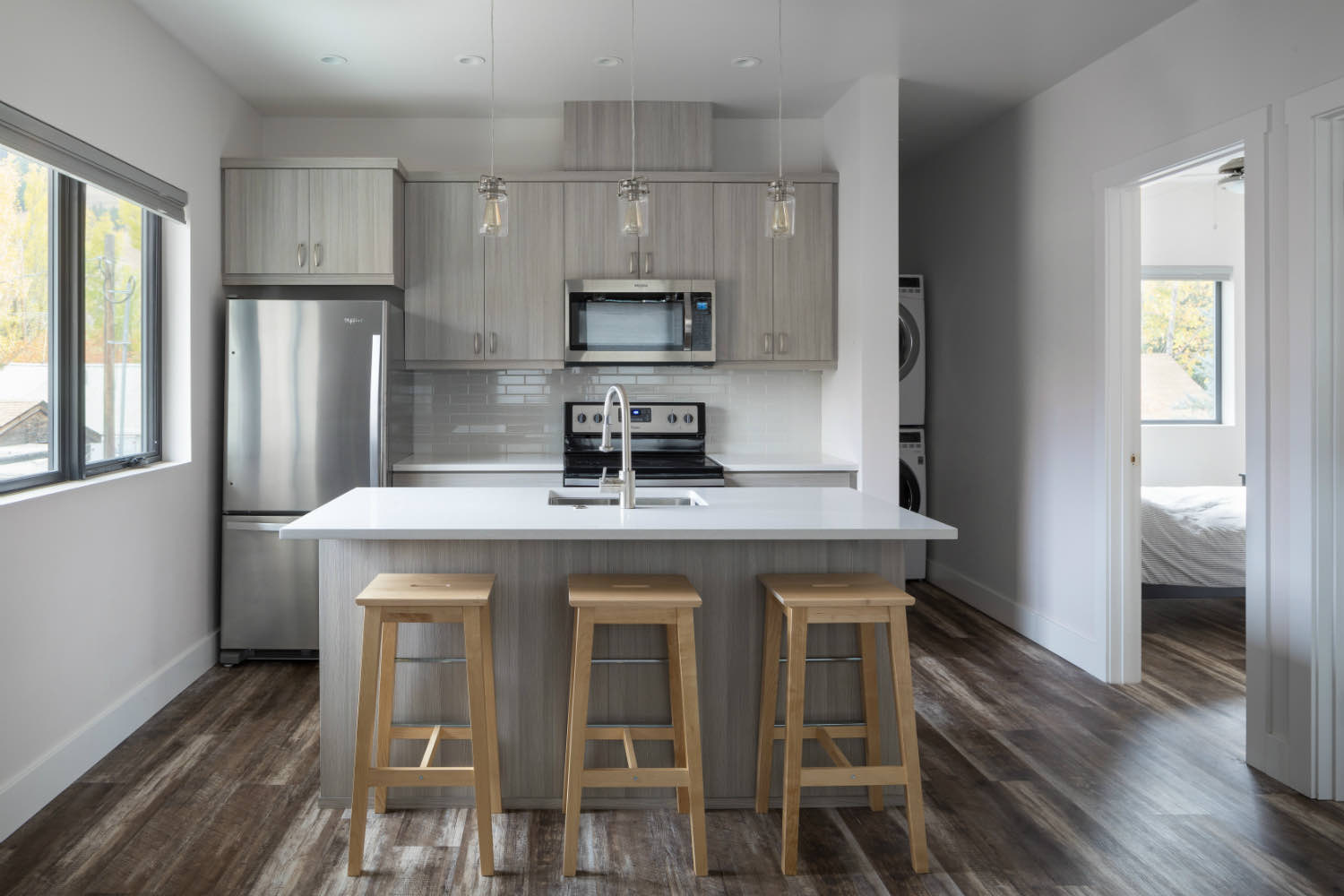
The lower level unit has its own compact kitchen with light gray cabinetry and simple wood stools at the island. It's efficient without feeling cramped, with the same attention to finishes and natural light as the main residence.
Material consistency across the project keeps things coherent. Metal siding, wood accents, black-framed windows, and steel railings repeat throughout, giving the building a clear identity. These aren't trendy choices; they're durable materials that will weather the mountain climate and look better with age.
If you're working with a tight urban lot and want to maximize space while maintaining connection to the landscape, these are the kinds of questions we work through. Reach out if you'd like to talk about your project.
Photos by Aaron Kraft